
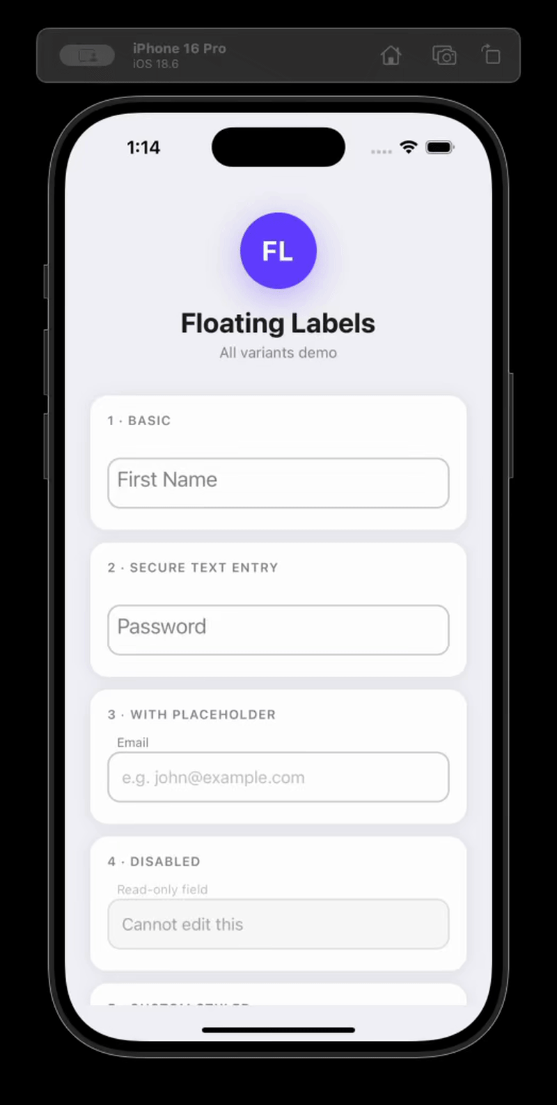
An animated floating label <TextInput> component for React Native (iOS, Android, and web via react-native-web).
npm install react-native-floating-labelsimport FloatingLabel from 'react-native-floating-labels';
<FloatingLabel>Email</FloatingLabel>;<FloatingLabel
labelStyle={{color: '#6200ea'}}
inputStyle={{borderColor: '#6200ea', borderWidth: 2, borderRadius: 8}}
style={{marginBottom: 16}}
>
Email address
</FloatingLabel>const [email, setEmail] = React.useState('');
<FloatingLabel value={email} onChangeText={setEmail}>
Email address
</FloatingLabel>;import FloatingLabel, {FloatingLabelHandle} from 'react-native-floating-labels';
const ref = React.useRef<FloatingLabelHandle>(null);
<FloatingLabel ref={ref}>First Name</FloatingLabel>;
ref.current?.focus();
ref.current?.blur();
ref.current?.clear();FloatingLabel accepts all standard TextInput props plus the following:
| Prop | Type | Default | Description |
|---|---|---|---|
children |
ReactNode |
— | The floating label text |
style |
ViewStyle |
— | Style for the outer container View |
inputStyle |
TextInputProps['style'] |
— | Style applied to the inner TextInput |
labelStyle |
TextStyle |
— | Style applied to the animated label |
disabled |
boolean |
false |
Disables the input (editable={false}); also sets accessibilityState.disabled automatically |
value |
string |
— | Controlled value; animates the label when changed externally |
secureTextEntry |
boolean |
false |
Hides input text (password field); also sets textContentType and autoComplete automatically |
errorMessage |
string |
— | Error text rendered below the input and announced by screen readers |
helperText |
string |
— | Helper text rendered below the input and announced by screen readers |
password |
boolean |
— | Deprecated — use secureTextEntry instead |
myRef |
React.Ref<TextInput> |
— | Deprecated — use the standard ref prop instead |
| Method | Description |
|---|---|
focus() |
Focuses the input |
blur() |
Blurs the input |
clear() |
Clears the input text and animates the label back to its resting position |
react-native-floating-labels is designed to work correctly with screen readers (VoiceOver on iOS, TalkBack on Android) and meets WCAG 2.1/2.2 AA, Section 508, and the React Native accessibility model out of the box — with no extra configuration required for common cases.
The component automatically derives accessibilityLabel from the children string so screen readers announce the label when the input is focused.
// Screen readers announce "Email" when this input receives focus
<FloatingLabel>Email</FloatingLabel>
Override it by passing accessibilityLabel explicitly:
<FloatingLabel accessibilityLabel="Your email address">Email</FloatingLabel>On web (react-native-web), accessibilityLabel is mapped to aria-label automatically.
When disabled={true} is passed, the component automatically sets accessibilityState={{ disabled: true }} on the input so screen readers announce it as unavailable.
<FloatingLabel disabled>Email</FloatingLabel>Override or extend accessibilityState as needed — your values take precedence:
<FloatingLabel disabled accessibilityState={{disabled: false, selected: true}}>
  Email
</FloatingLabel>When secureTextEntry={true} is passed, the component automatically sets:
textContentType="password"(iOS) — enables password autofill and correct VoiceOver announcementautoComplete="password"(Android/web) — enables password autofill
<FloatingLabel secureTextEntry>Password</FloatingLabel>Override when you need a more specific value (e.g. for a new password field):
<FloatingLabel secureTextEntry textContentType="newPassword" autoComplete="new-password">
  New Password
</FloatingLabel>
Add an accessibilityHint to give users extra context:
<FloatingLabel secureTextEntry accessibilityHint="Must be at least 8 characters">
  Password
</FloatingLabel>Pass errorMessage to render error text below the input. It is announced by screen readers whenever the value changes (via accessibilityLiveRegion="polite").
const [error, setError] = React.useState('');

<FloatingLabel value={email} onChangeText={setEmail} errorMessage={error}>
  Email
</FloatingLabel>;Pass helperText to render supplementary guidance below the input. Like errorMessage, it uses accessibilityLiveRegion="polite" for dynamic announcements.
<FloatingLabel helperText="We'll never share your email">Email</FloatingLabel>The component does not enforce focus styles — this keeps it flexible for any design system. To implement a WCAG 2.2-compliant visible focus indicator, use onFocus/onBlur with inputStyle:
const [focused, setFocused] = React.useState(false);

<FloatingLabel
  inputStyle={focused ? {borderColor: '#0057b8', borderWidth: 2} : undefined}
  onFocus={() => setFocused(true)}
  onBlur={() => setFocused(false)}
>
  Email
</FloatingLabel>;
WCAG 2.2 requires the focus indicator to have a contrast ratio of at least 3:1 against adjacent colors.
Apple and Google both recommend a minimum touch target of 44×44dp. The component's default height is 40dp. To meet the recommendation, set style on the container:
<FloatingLabel style={{minHeight: 44}}>Email</FloatingLabel>Before shipping, verify the following manually with screen readers enabled:
iOS — VoiceOver (Settings → Accessibility → VoiceOver):
- Focusing the input announces the label text
- A disabled input is announced as "dimmed" or "unavailable"
- A password input is announced as a "secure text field"
- Error messages are announced when they appear
- Helper text is readable when navigating to the input
Android — TalkBack (Settings → Accessibility → TalkBack):
- Focusing the input announces the label text
- A disabled input is announced as "disabled"
- A password input is announced as a password field
- Error messages are announced when they appear
- Helper text is readable when navigating to the input
The quickest way to test the library end-to-end against a real device or simulator before publishing.
Expo (recommended — no Xcode/Android Studio required for quick tests):
npx create-expo-app@latest FloatingLabelsTest
cd FloatingLabelsTest
Bare React Native:
npx @react-native-community/cli init FloatingLabelsTest
cd FloatingLabelsTestRun this from the library root. It produces a tarball (e.g. react-native-floating-labels-2.0.0.tgz) that mirrors exactly what gets published to npm:
npm run build
npm packnpm install /path/to/react-native-floating-labels-2.0.0.tgzFor Expo, no additional linking is required. For bare React Native, run npx pod-install on iOS.
Replace the contents of App.tsx (or App.js) with:
import React, {useRef} from 'react';
import {Button, SafeAreaView, StyleSheet} from 'react-native';
import FloatingLabel, {FloatingLabelHandle} from 'react-native-floating-labels';

export default function App() {
  const ref = useRef<FloatingLabelHandle>(null);

  return (
    <SafeAreaView style={styles.container}>
      <FloatingLabel style={styles.field}>First Name</FloatingLabel>
      <FloatingLabel style={styles.field} secureTextEntry>
        Password
      </FloatingLabel>
      <FloatingLabel ref={ref} style={styles.field}>
        Ref-controlled field
      </FloatingLabel>
      <Button title="Clear via ref" onPress={() => ref.current?.clear()} />
    </SafeAreaView>
  );
}

const styles = StyleSheet.create({
  container: {flex: 1, padding: 24, backgroundColor: '#fff'},
  field: {marginBottom: 16},
});# Expo
npx expo start
# Bare React Native — iOS
npx react-native run-ios
# Bare React Native — Android
npx react-native run-androidIf you want to test the published beta instead of a local tarball:
npm install react-native-floating-labels@betaSee CONTRIBUTING.md for the development workflow, Conventional Commits format, and release process.
MIT Licensed