PolyY is a lightweight and intuitive Python library built on top of Plotly Graph Objects, designed to simplify the creation of multi–Y-axis interactive charts.With PolyY, you can easily visualize multiple datasets with different scales on the same figure — without losing clarity, interactivity, or control. The library provides a clean object-oriented interface to build, customize, and update complex figures in just a few lines of code.
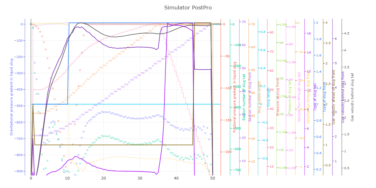
🔹 Multi Y-Axis Support: Effortlessly plot multiple series with independent Y-axes while maintaining alignment and scale integrity.
🔹 Built on Plotly Graph Objects: Leverages Plotly’s powerful graph_objects module for high-quality, interactive visualization.
🔹 Full Interactivity: Zoom, pan, hover, and toggle traces directly in the figure — no static images or re-renders needed.
🔹 Fine Figure Control: Access and modify each trace, axis, and layout component with full Plotly compatibility.
🔹 Dynamic Trace Management: Add, update, or restyle traces after creation — ideal for data exploration and dashboard integration.
*As of Version 0.1.5 : X title, auto color assign, enhanced documentation.
*As of Version 0.1.3 you can manually control right domain value (part of plotly subplot xaxis domain parameter)
Check the Layout.xaxis domain for more info.
*Transparecy is supported and controlled via opacity parameter, currently support for scatter, bar, line, step.
*Legend is Visible.
The library is built as a single class interface to plotly via MakeFigure.It's built on OOP and it can be expanded with ease and new features can be implemented.Each line/element in the chart is added by using add_trace function (same function found in plotly.graph_objects module), each time this function is called, a single trace will be added to the chart.
from polyY.plotly import MakeFigure
fig = MakeFigure(right_domain=0.88) #if not provided, it will be calculated automatically and it can't take more than 50% or right domainfig.add_trace(xdata, ydata, name_of_the_trace_goes_here, the_color, opacity)
#fig.add_trace(xdata, ydata, "Daily Sales", "red", opacity=0.3) => 30% trasparencyfig.show()fig.update_layout(...)
fig.update_xaxes(...)
fig.update_yaxes(...)import polyY.plotly as plot
import pandas as pd
elect = pd.read_csv(r"data\electricity_consumption_data.csv")
x = elect.timestamp
ys = ['power_kwh', 'voltage_v', 'current_a', 'temperature_c', 'reactive_power_kvar']
clrs = ["pink", "magenta", "green", "purple", "orange"]
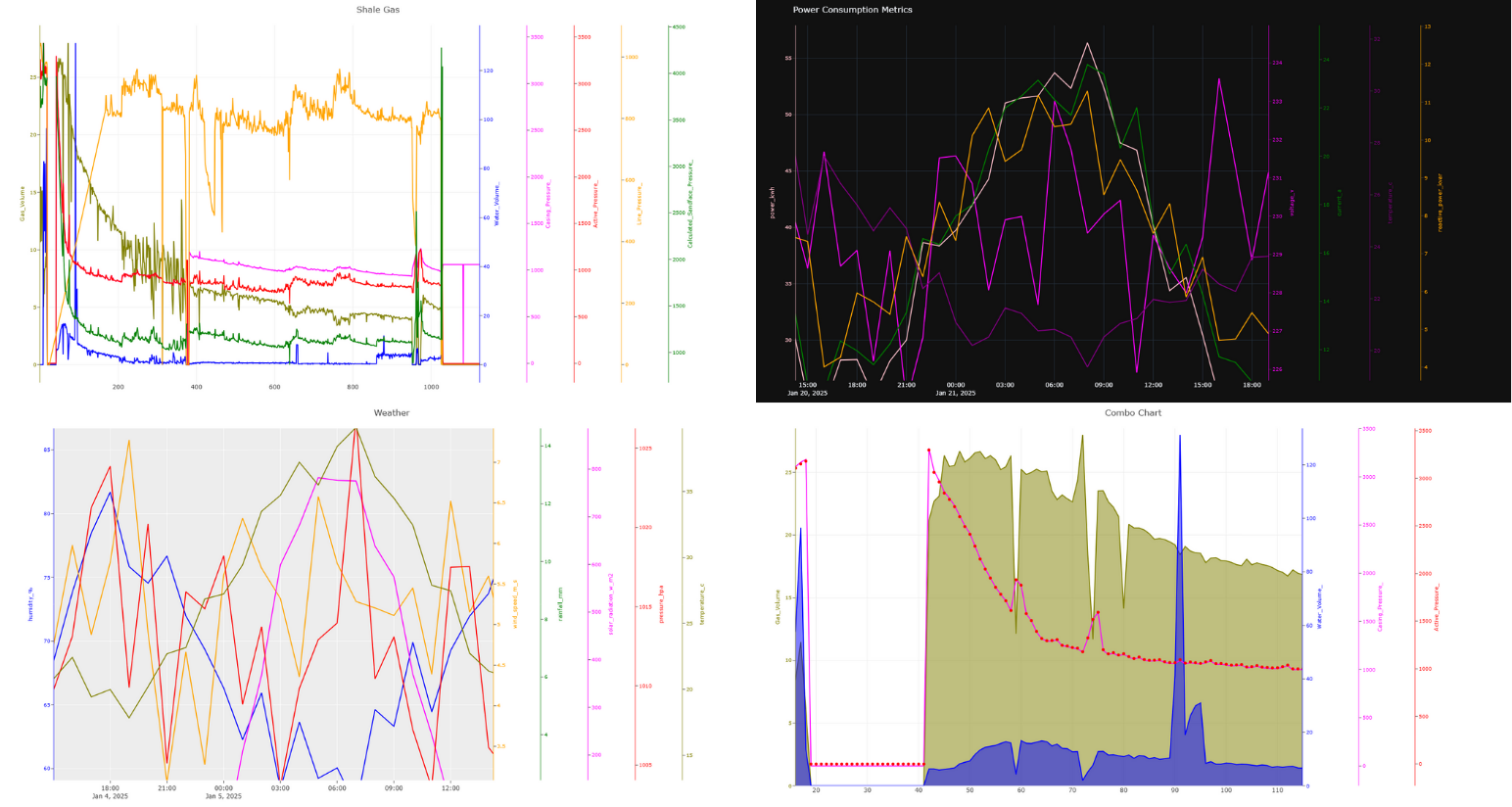
figure = plot.MakeFigure("Power Consumption Metrics", "plotly_dark")
for i in range(5):
figure.add_trace(x, elect[ys[i]].to_list(), name=ys[i], kind="line", color=clrs[i])
figure.get_figure().update_layout(width=1500, height=800)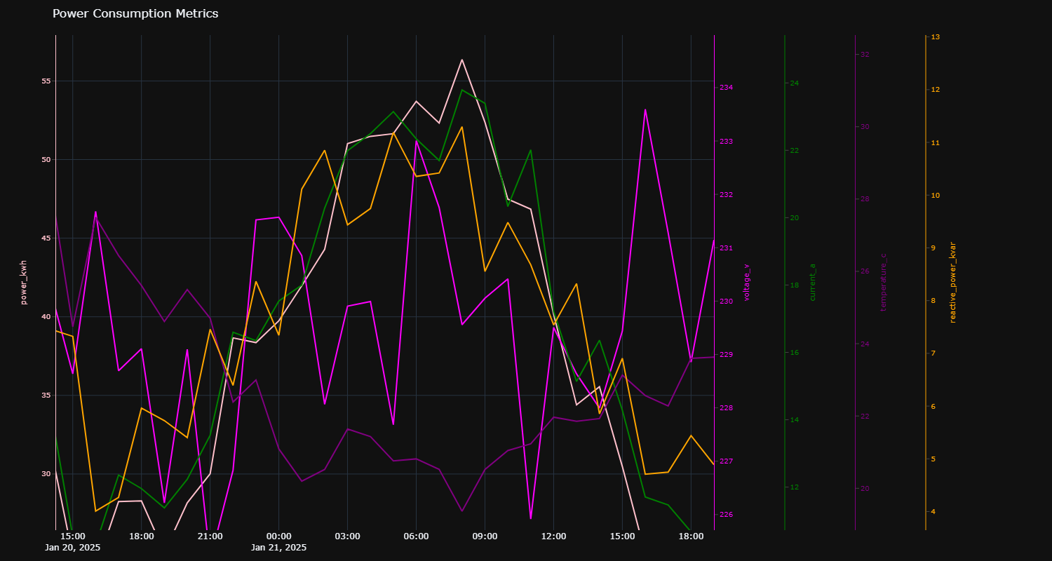
import polyY.plotly as plot
import pandas as pd

data = pd.read_csv(r"data\oil and gas.txt", sep="\t")
x = data.Time_Days
ys = ['Gas_Volume', 'Water_Volume_', 'Casing_Pressure_', 'Active_Pressure_', 'Line_Pressure_', 'Calculated_Sandface_Pressure_']
clrs = ["olive", "blue", "magenta", "red", "orange", "green"]

figure = plot.MakeFigure("Oil and Gas Production Metrics", "none")
for i in range(6):
    figure.add_trace(x, data[ys[i]].to_list(), name=ys[i], kind="line", color=clrs[i])
figure.get_figure().update_layout(width=1500, height=800)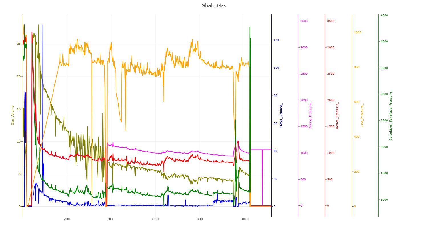
import polyY.plotly as plot
import pandas as pd

data = pd.read_csv(r"data\weather_data_500.csv")
x = data.timestamp
ys = ['humidity_%', 'wind_speed_m_s', 'rainfall_mm', 'solar_radiation_w_m2', 'pressure_hpa', 'temperature_c']
clrs = ["blue", "orange", "green", "magenta", "red", "olive"]

figure = plot.MakeFigure("Weather and Forecast Metrics", "ggplot2")
for i in range(6):
    figure.add_trace(x, data[ys[i]].to_list(), name=ys[i], kind="line", color=clrs[i])
figure.get_figure().update_layout(width=1500, height=800)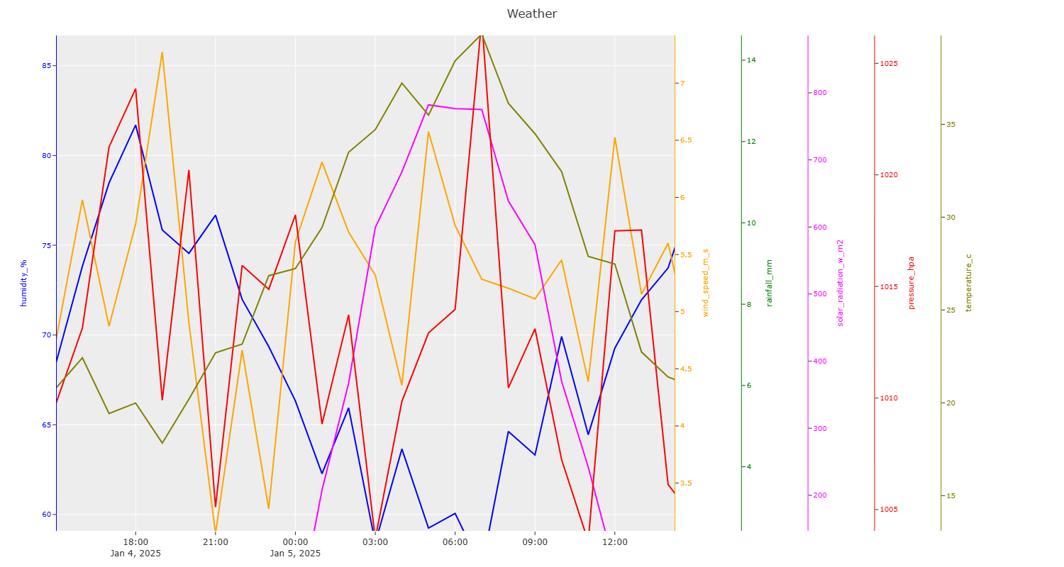
import polyY.plotly as plot
import pandas as pd

data = pd.read_csv(r"data\oil and gas.txt", sep="\t")
x = data.Time_Days
ys = ['Gas_Volume', 'Water_Volume_', 'Casing_Pressure_', 'Active_Pressure_']
clrs = ["olive", "blue", "magenta", "red"]
types = ["area", "area", "line", "scatter"]

figure = plot.MakeFigure("Combo Chart Example", "none")
for i in range(4):
    figure.add_trace(x, data[ys[i]].to_list(), name=ys[i], kind=types[i], color=clrs[i])
figure.get_figure().update_layout(width=1500, height=800)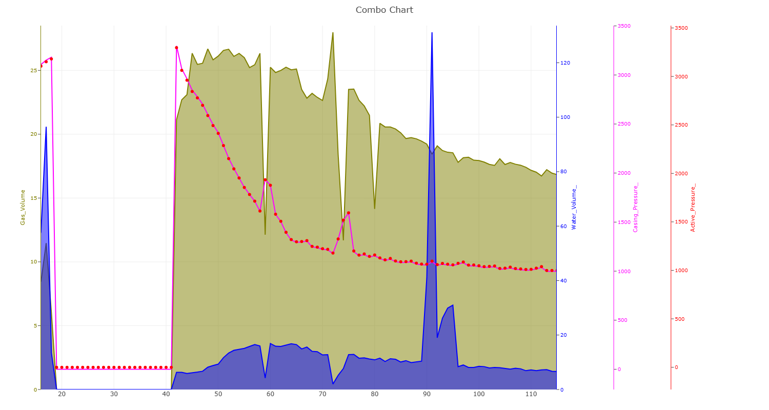
import polyY.plotly as plot
import plolty.graph_objects as go
import pandas as pd

data = pd.read_csv(r"data\oil and gas.txt", sep="\t")
x = data.Time_Days
ys = ['Gas_Volume', 'Water_Volume_', 'Casing_Pressure_', 'Active_Pressure_']
clrs = ["olive", "blue", "magenta", "red"]
types = ["area", "area", "line", "scatter"]

figure = plot.MakeFigure("Combo Chart Example", "none")
for i in range(4):
    figure.add_trace(x, data[ys[i]].to_list(), name=ys[i], kind=types[i], color=clrs[i])
for n in other_data:
    # for yaxis, you can choose from y,   y2,             y3,                  y4
    # yaxis as created : 'Gas_Volume', 'Water_Volume_', 'Casing_Pressure_', 'Active_Pressure_'
    figure.get_figure().add_trace(go.Line(data.Time_Days, data[n], name="Suplementary Curves"+n, yaxis="y2"))

figure.get_figure().update_layout(width=1500, height=800)