Create a gif animation for data transformation
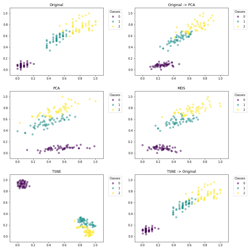
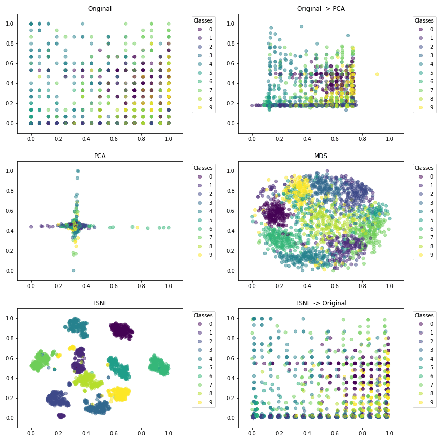
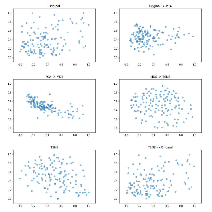
The jupyter notebook Example.ipynb presents a simple example on the iris, digit and pairwise distance datasets. First, we display the data on the most predictive axis of the original data, then on PCA projections then on TSNE, we observe how the different classes are separated from one tranformation to another. We min max normalize the data for better visualization.
It will produce the following gif images:
Contains the main functions necessary for the creation of a gif from different visualization.
This visualizer depends on matplotlib and numpy and has been developped under python3.7.
Current code is not optimized to be fast, do not hesitate to contribute to improve it.